Multicolumns
Overview
Multicolumn Options (Container Level)
Heading
The Multicolumn component in most cases will be it's own section of the page, therefore, in these cases the Heading should be populated for SEO and Accessibility. As in all components (with the exception of the Generic Hero and Heading Tag), the Heading will always be an H2. If you have populated the Heading, please use the "Heading 3" for content sections within the same Multicolumn. The Heading may be aligned Left (default) or Center on the page.
Subtext
This text area, itself, is the Subtext of the Multicolumn component. You may enter text above the columns within the component. The Subtext may be aligned Left (default) or Center on the page.
Background Image and Background Color
Background Image is an option to add a subtle image to the background of the component. The component content within the page has a max with of 1440px, but the component itself spans full with of the browser window, so the background image will span to cover the background of the component (section) across the full width of the window. Example
Background Color is an option to add a brand color (hopefully subtle) to the background of the component section. This must be a HEX value (i.e. #dee1ef). Example
Text Color Light
The default color of the text is Lifeway Gray (#414042). This is an option to change the text to white. This will be needed when a dark Background Image or Color is applied. Example
** NOTE: When choosing an background image or color please make sure to check its contrast with the text color chosen to insure that it passes a AA level in order to improve readability for those with vision issues. You can use https://webaim.org/resources/contrastchecker/ to check (the "foreground" would be the text color you have chosen white="#ffffff" or gray="#414042")
Text Small
The text size is 16px by default. This option reduces the size of the text within the columns as well as the component Subtext to 14px. This should not be used often nor on large bodies of text. A better example of use would be something like a list of products when the number of columns per row is set to 6. Example
Number of Columns
This is the maximum number of column tiles that will reside on a row at the largest browser window width. As the site is responsive (the flow of the site content will change depending on the screen
/browser window width), the number of columns tiles will wrap to the next row as the browser window becomes smaller. The breakpoints are different for each number designations.** NOTE about Videos and Non-Image Media when choosing columns: The more columns per row, the smaller the columns will be. When including video, it is best to not designate the number of columns as more than 3. This should be a minimum for a video, which will render at 448px wide at the largest window and as small as 288px at some browser window sizes. When showing videos and media, 2 columns is best. Example
Tile Layout
Default Tile
A more "freeform" option
little default styling
rounded edges applied to top of image and bottom of the text block
the text block will have a background color or a border
the image will conform to cover a 4:3 ratio
a video or embedded content should not be added to Card Tile Layout. Though, a video can be added to a tile included in a Card Tile Layout, only the video will appear in 16:9 ratio and the Block text will appear as a detached rounded block. This is not optimal and it is recommended to only add videos to the Default Layout (at least for now).
within a column tile, the image will appear left of the column text in somewhat of a 50/50 sub-column split
Media Sizing
This field is optional. If no value is designated, the image will only be constrain by the width of its containing column, but will grow to whatever height necessary to fill that width. Keep in mind this will not provide a uniform look across columns with images that have slightly varied ratios/dimensions.
Media Sizing options:
fixedShort - allows image to grow to a maximum height of 130px regardless (and by column width)
fixedMedium - allows image to grow to a maximum height of 200px regardless (and by column width)
fixedTall - allows image to grow to a maximum height of 300px regardless (and by column width)
square - constrains the image to a height that is equal to the width of the column (a square, 1:1 ratio)
video - constrains the image to a height that 9/16 (56.25%) the width of the column (a rectangular video ratio, 16:9)
NOTE: Media Sizing does NOT apply to the image when using the Card Tile Layout option.
Turn OFF Rounded Corners on Media
Images and Media have rounded corners by default
This setting will not be applied when Card Tile Layout is selected. Use Default Tile Layout if rounded corners need to be turned off.
An example of when rounded corners need to turned off is when using a product image (see the example of the 6-column product grid)
Align Columns Center
This is will center-aligned the column tiles (not the content within the columns)
Centering the columns within the grid is the default
Align Column Content Center
This is will center-aligned the column content/text within the columns
The content within the columns is left-aligned by default
This setting does not apply to the Card Tile Layout (content will alway be left-aligned regardless).
Grid Items
Multi Column > Tile (most commonly used)
Multicolumn Tile Options
Column Heading
Option heading (H3) that appears under the image (if image exist)
Light Text
Only applies to Card Tile Layout
Text is gray by default, but should be applied (to turn text white) when text background is set to a darker color.
Use https://webaim.org/resources/contrastchecker/ to check if background and text color have appropriate contrast
Text Background Color
Only applies to Card Tile Layout
Background is white with border by default. This must be a HEX value (i.e. #dee1ef).
Use https://webaim.org/resources/contrastchecker/ to check if background and text color have appropriate contrast
Column Text
standard Rich Text Editor
Image URL
Please make sure that the image is appropriately sized (width) for the column numbers. Images Widths:
2 & 3 column: 720px
4 column: 500px
5 column: 350px
6 column: 250px
Card Tile: 700px by 525px.
*NOTE* If Image URL is populated, it will override any video or embed within this tile.
Link URL for Image
This only applies the link to the image (if image is populated)
Link URL Target for Image
This only applies to the link the image (if image is populated)
"_self" opens the link in the same window/tab
"_blank" opens the link in a new window/tab
Image Link Title
This is text that will appear after a second or 2 of hovering the image
Image Alt Text
This should be a very short description of the image for the visually impaired
If the image is linked, the image should describe what the image is linked to
Brightcove Video ID
Video ID will be overridden (ignored) if Image URL is populated.
Video ID will override Playlist ID and Embed Content (if populated).
This will only work with Brightcove video IDs.
Brightcove Playlist ID
Playlist ID will be overridden (ignored) if either Image URL or Video ID is populated.
Playlist ID will override Embed Content (if populated).
This will only work with Brightcove playlist IDs.
Embed Content
To embed iframes or other scripts that generate content (i.e. 3rd-party catalog viewer script).
Buttons
Allows ability to add 1 or more Button components
This is the standard Button component so after creating these buttons, they may be use in other components and content.
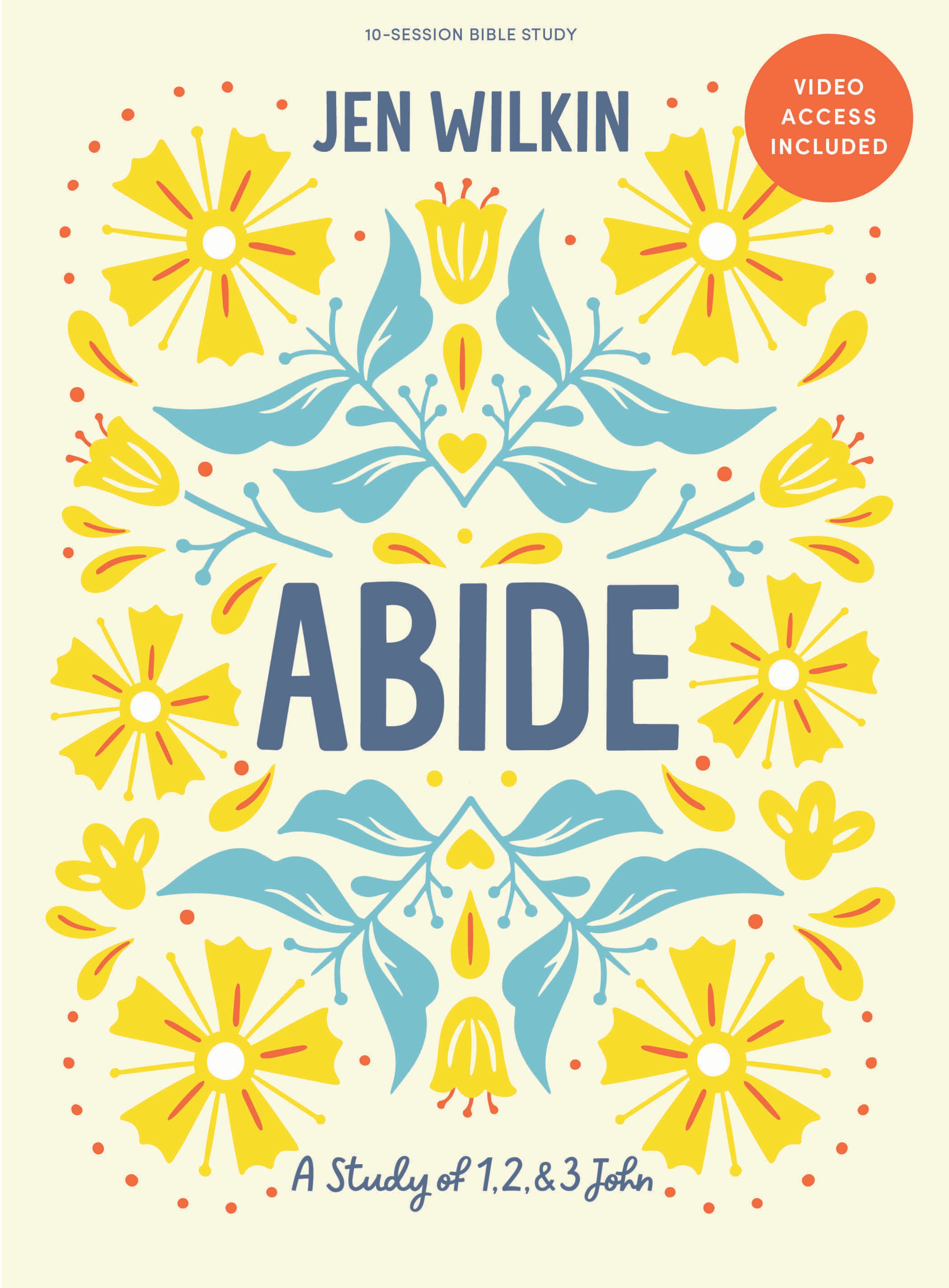
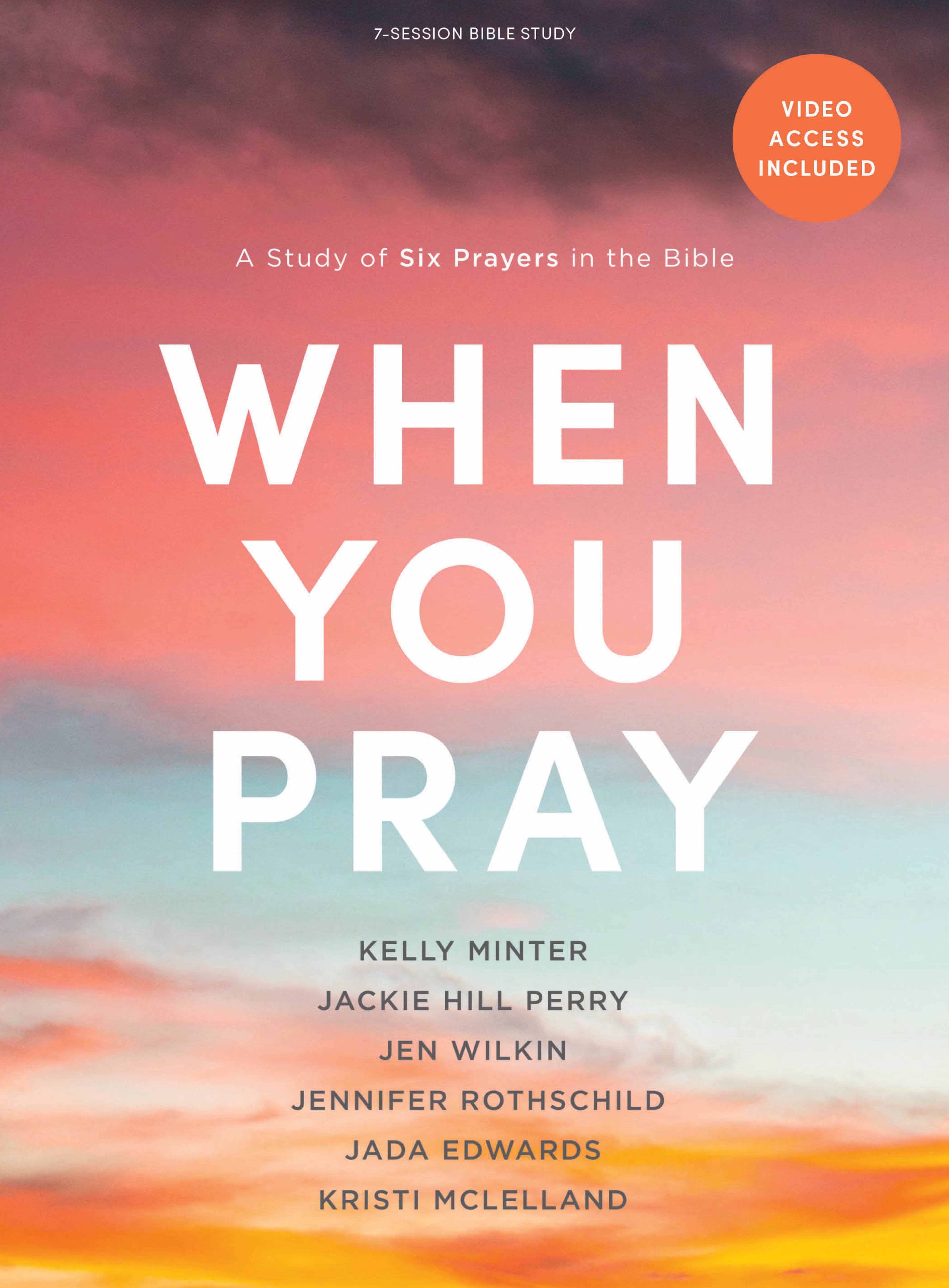
More Ways to Study with Jen Wilkin

Online Courses for Women, by Women

Join Jen for an Online Event
April 29, 2023

See Jen at an Event Near You
Various Dates
More Ways to Study with Jen Wilkin Fixed Medium Image Height

Online Courses for Women, by Women

Join Jen for an Online Event
April 29, 2023

See Jen at an Event Near You
Various Dates
More Ways to Study with Jen Wilkin
In some cases you may need to only have 2 or 3 columns, but do not want the columns to be large and do not need the columns to span the whole window width. In this case. you can just add your columns and set "Number Of Columns" to a higher number like 5 or 6. This will set the width of the column to a smaller percentage

Online Courses for Women, by Women

Join Jen for an Online Event
April 29, 2023

See Jen at an Event Near You
Various Dates
Products, Images Fixed Short, 6-column, Small Text
Products, Images Fixed Medium, 6-column, Small Text
Product, Images Square, 6-column
Products, Images Fixed Tall, 6-column
Products, Images Fixed Tall, 4-column
2-Column Media (Videos, Images, and Embeds/iframes/scripts)
When displaying video and embeddable content set "Media Sizing" to "video". Keep in mind, if you intermix images and video (at a 16:9 ratio) and set "Media Sizing" to "video", images will be contained to the 16:9 ratio container while also being aligned to the left and bottom as seen within this multicolumn below.
My Cumlumn Title
This is Column Text.
And a Heading
Testing some Subtext.
50/50 Text Column and Media Column
When needing to add a 2-column layout, one column being text and the other being media (i.e. image, video, iframe catalog), the multicolumn CAN be used for this.
On Mobile, when creating the Text and Media 2-column layout, it's standard to have the media appear first as the user scrolls down and the text column will follow.
When the user is viewing this same component on desktop, you may want the media to be on the right, but the Multicolumn cannot change the order.
If you need the media to appear on the right on Desktop and also appear above/before the text on Mobile please use the Two Column Text & Media component
This image is a video ratio (16:9) 720x405.
This 320x205 (landscape) is contained by its width and bottom-and-left-aligned.


Adding a Form to the Multicolumn
Just as you can add an Article Detail page as a column to a Multicolumn component, you can add a Form entry
If adding a form to the multicolumn:
Make sure that the number of columns set to 2 to allow the most width for the form to expand. Smaller (more) columns is not ideal for embedding a form.
It's best is the the form is short (just a few fields) and NOT like the form displayed here.
Side by Side
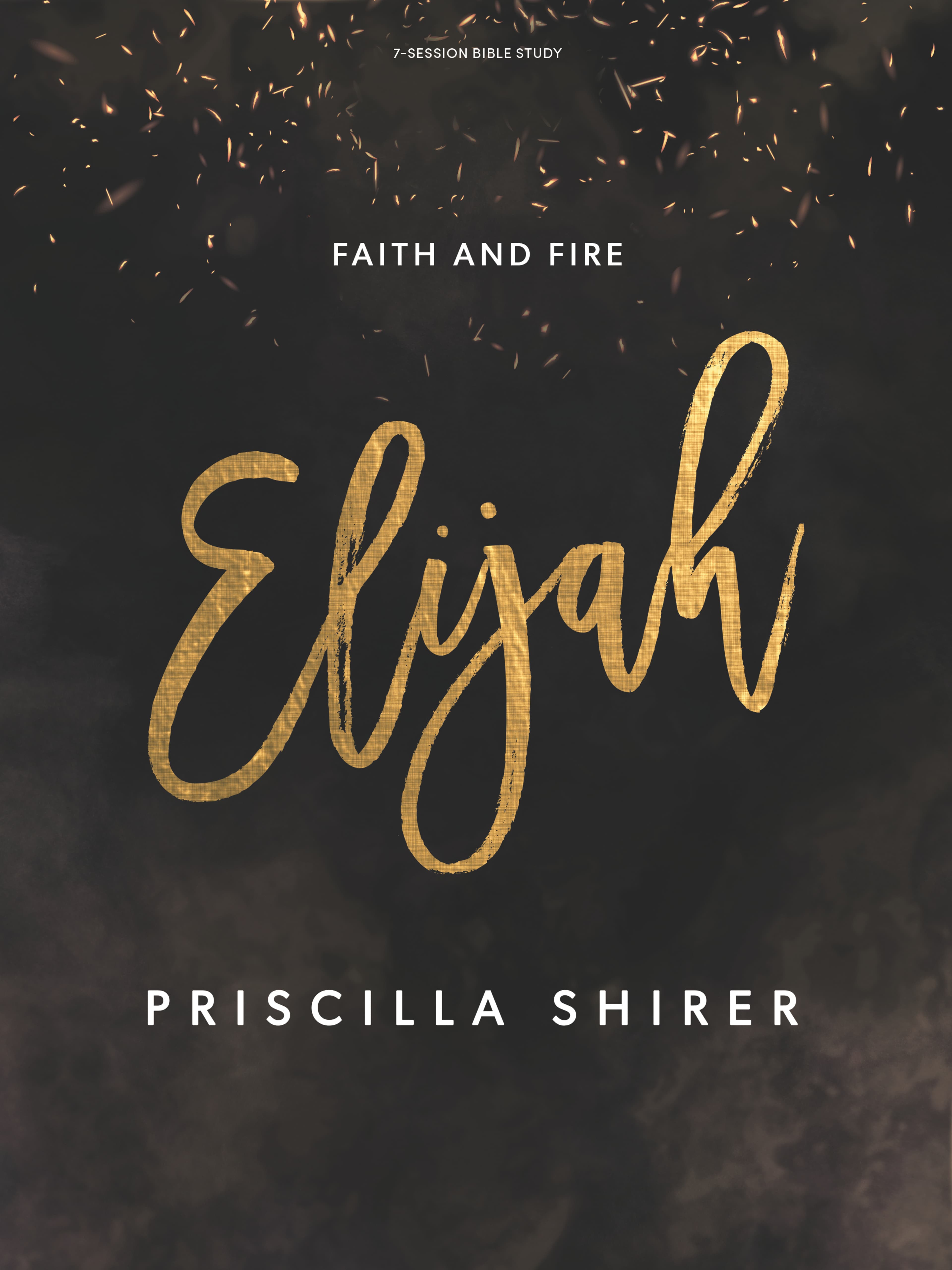
Priscilla Shirer
Through the expository teaching of the Word of God, Priscilla Shirer desires to see people not only know the uncompromising truths of Scripture intellectually, but experience them practically by the power of the Holy Spirit. Founder of Going Beyond Ministries with her husband Jerry, Priscilla is the author of more than a dozen books and Bible studies on a myriad of topics and biblical characters.
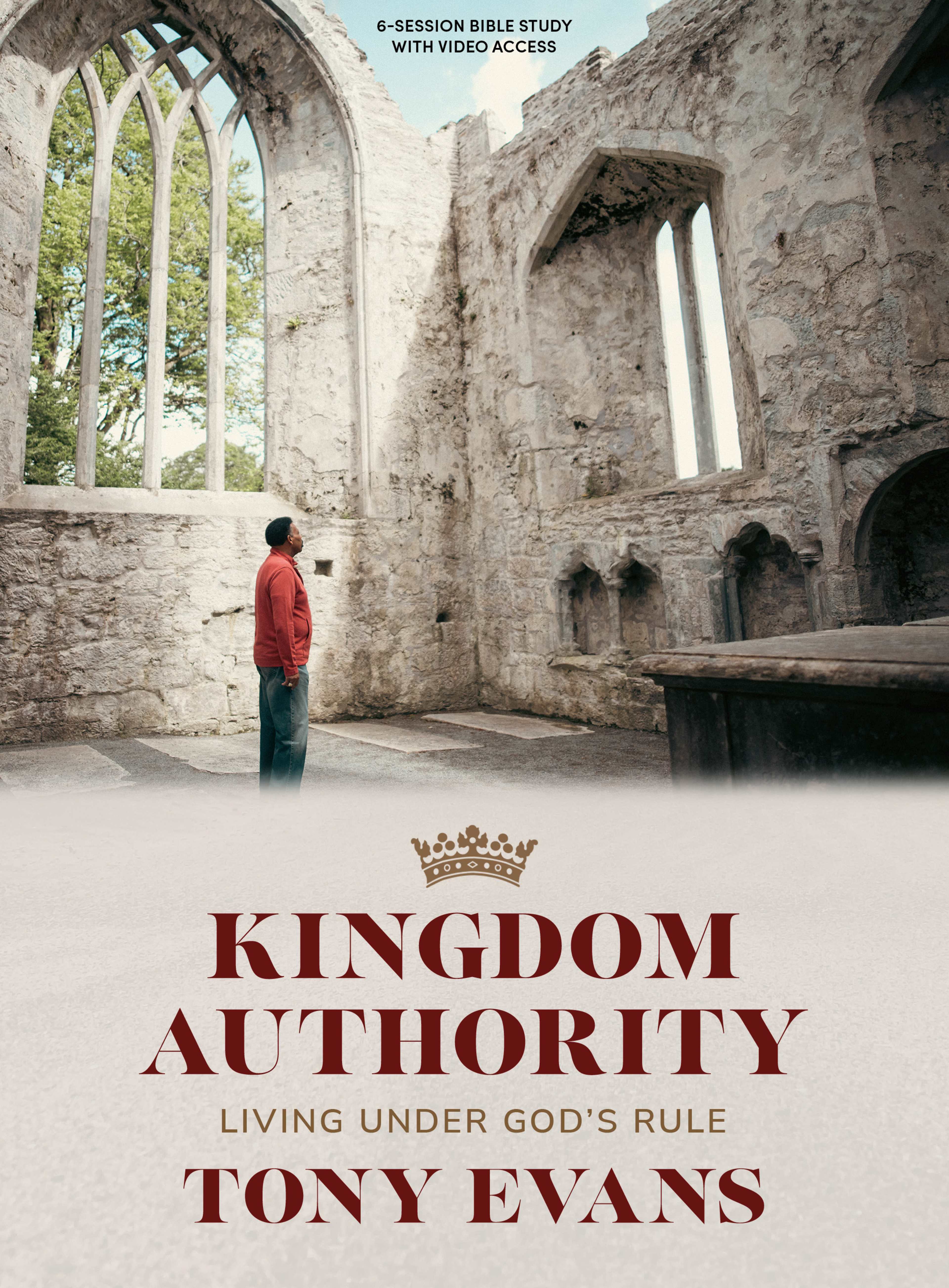
Tony Evans
Tony Evans is a pastor, teacher, author, speaker, and one of the country's most respected leaders in evangelical circles. Through his local church, Oak Cliff Bible Fellowship, and national ministry, The Urban Alternative, Dr. Evans promotes a Kingdom agenda philosophy that teaches God's comprehensive rule over every sphere of life as demonstrated through the individual, family, church, and society.
Multicolumn of Articles
As we remember Christ’s birth this Advent season, we long for His return. We celebrate the new life in Christ we have, yet we still hope for a place with no more grief, no more pain, no more death. Through the promise of salvation, this hope will be fulfilled at His return.
October 8, 2024
- Erin Franklin
Joy is never the absence of sorrow. It’s the recognition of a savior who came to sit with you in it and spare you the final weight of it. A weary world only rejoices when it knows how weary it is.
December 8, 2021
- Nic Allen
Tthe reason we sing Advent carols about the birth of Jesus is because He came to die to free us. Christmas may be all about a monumental birth, but what the world so desperately needed was a sacrificial death.
October 9, 2024
- Nic Allen
Event Price Tile
Price Tile Title 1
$85
per ticket
Default look and "per ticket" label
Price is populated
Enabled Register button
Price Tile Title 1
Just text
No price entered so price line is omitted
No button - Button Text left blank
Price Tile Title 3
$750
per group
Simulcast example
Price is populated
"Per" label is populated
Button Text and URL left blank
Item Number is Populated
Price Tile Title 4
$85
per church
Last,
we have just
one disabled button
with whatever text you want.
Card Layout with No images
Use the Text Background Color field to designate the color of the tile, which is applied to the Multicolumn Tile ONLY for the Card Layout.
If no Text Background Coloris designated, then the card will have a border. This border is only available on the Card Layout
Designating the Text Background Color of white (#ffffff) is intended for a Card Layout on a Mullticolumn component with a non-white background.
If on a white background, leave the field Text Background Color blank to add a border around the card. Otherwise, if all cards are to be white change from Card Layout to used Default Layout instead.
Green Card No Image
Nullam commodo ipsum sed mi accumsan dictum.
Praesent tristique sagittis iaculis.
Fusce eget ex orci.
Sed a nisl commodo, mattis justo ut, ornare est.
Nulla facilisi.
Aenean blandit libero ipsum, ac aliquam lectus porta ac.
Card No Image or BG Color
Morbi sit amet elit massa. Donec non porttitor nulla. Nunc nec augue nec orci tempor tempor ut a ipsum. Aenean vestibulum pretium ex sit amet tristique. Suspendisse ac quam ante.
Vestibulum vulputate elementum nunc, id venenatis odio convallis ac. Maecenas id vehicula eros, non suscipit velit.
White (#ffffff) Card No Image
Aliquam luctus in lorem vel finibus. Donec eu nisl sit amet ex accumsan mollis.
Fusce a est sed dui pharetra suscipit at vel tellus.
Maecenas aliquet, nisl ut lobortis vehicula, neque lorem elementum lacus, sit amet mollis odio lectus a eros.
Mauris eleifend quam eget erat efficitur malesuada.
Multicolumn Card Layout 2-Column
Make a joyful noise to the Lord
The apostle Paul encouraged the Roman believers, “Do not be conformed to this age, but be transformed by the renewing of your mind” (Rom 12:2). Here are five means by which we can appropriate the truth of Scripture for spiritual transformation.
Add protection with style
Multicolumn 3-CARD
This is not recommended
Notice that the text block is not attached to the media as seen in the image card tile above. Please use the Default Tile layout when including media.

